Canada’s Youth Report
Redesign of a bilingual report published by the Government of Canada with the goal of supporting Canadian youth.

/01 CHALLENGE
Accommodate content to fit varied character count.
Canada’s first State of Youth Report is a bilingual publication released by The Government of Canada. This report is meant to engage, encourage, and empower the voices of young people today and for future generations. The task was to combine both the English and French versions of the report.
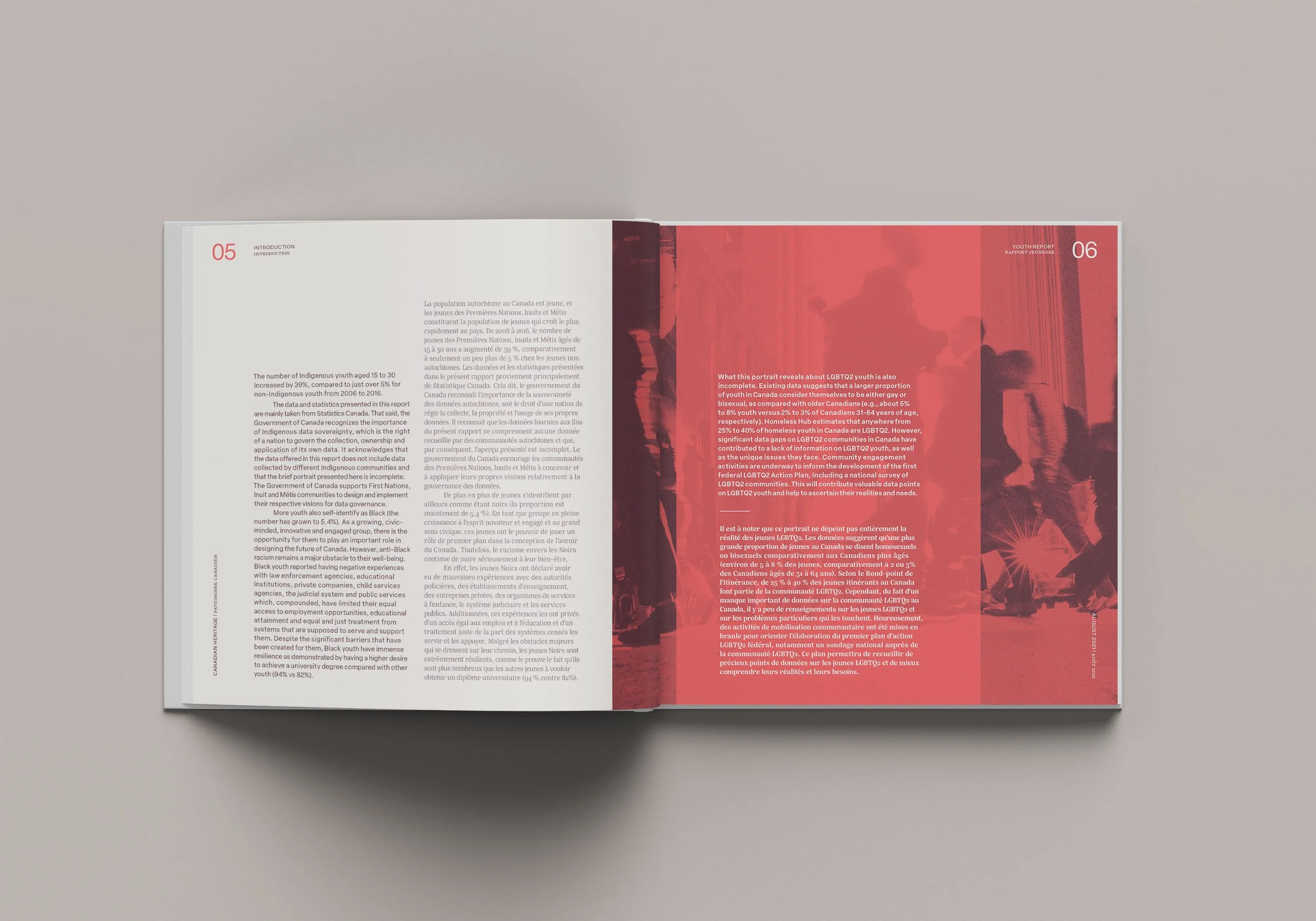
The challenge was to typeset different character count from English to French while still maintaining a balanced layout and distinct indicators for each language.

/02 SOLUTION
A consistent, clean, and easy-to-read layout.
In order to keep everything consistent and organized, the approach involved a simple and easy-to-read layout with an effective type hierarchy. The English text is set in a sans-serif typeface and darker colour to differentiate from the French text, which is set in a serif typeface and lighter colour. The strategy was to choose a serif and sans-serif typeface designed by one type foundry, which allowed for the overall composition to feel harmonious.
The colour palette - bright yet sophisticated - helps capture the interest of the primary target audience. The photography features diverse individuals in authentic and realistic environments to allow viewers to relate with the content of the report.


The final document includes an infographic, full bleed images, and pull quotes that highlight valuable insight into the well-being of youth in Canada and their thoughts about issues that matter most to them.
