CASE STUDY • REBRAND • DIGITAL
Coastal Jazz
Rebranding BC’s largest not-for-profit music presenter with an emboldened contemporary identity that reinforces its mission.

RECOGNITION
2023 RGD Student Awards, Arnold Street Media Award for Logo Design, Honourable Mention
/01 CHALLENGE
Modernize the Coastal Jazz brand to reflect its history and the unexpected nature of jazz music.
The creative challenge was to assess our given client’s current context, and identity issues surrounding their brand, positioning, assets, and competition. From there, we were tasked to present a new identity that is an improvement and better serves the client, along with a graphics standards manual and supporting assets.
Founded in 1985, Coastal Jazz is a community-based, not-for-profit, charitable arts organization. Today, the organization plays a significant part of Vancouver and BC’s economic engine and tourism industry. In addition to presenting exceptional music, the Coastal Jazz Festival is a leader in many outreach activities that enrich and strengthen the community.

/02 STATEGY
Celebrating the past, to appreciate the present.
I began by gathering points about jazz and its local history in the Vancouver community. So how did Vancouver become a hotspot for jazz in the Pacific Northwest? Considering the roots of jazz were largely nourished in New Orleans and Chicago.
Through my research, I learned that the jazz scene started with The Cellar – Vancouver's only full-time jazz club. Until its closing in 1963, it was known as “one of the leading jazz clubs in North America”. It hosted local jazz musicians and international jazz performers.
The branding needed to connect the city's rich history and match the unexpected and dynamic nature of jazz. All while appreciating the musical diversity of the present.
Since the organization is no longer Jazz-exclusive and many people attend events throughout the year, it was important to note that while the festival targets Jazz enthusiasts of all ages, the brand should attract a broader group of people and consider younger visitors as part of the target.
Over 3 weeks, I developed a series of identity concepts. Not all of them were impressive but they had to be put down in order for me to move on. And although I faced multiple challenges such as staying away from variations of the same sketch or coming up with new ideas in general, I spent a lot of time exploring and thinking about different degrees of abstraction and different scales for various letters.
/03 SOLUTION
Inspired by musical notes.
Taking inspiration from the dynamic nature of musical notes on a music sheet, I was able to create an unexpected concept for the newly revised logo. The brand’s focus is the heritage of jazz, so in order to reflect this, I took the word jazz and incorporated it into the brandmark. This way Coastal Jazz still contains the word jazz but now it feels much more intentional yet abstract.

The primary brand colours are black, white, and grey. They form the foundation of everything Coastal Jazz. These colours are used to provide accessibility, simplicity and consistency throughout all brand communications. Coastal Blue and Vibrant Violet are used as accent colours. They bring a bright and contemporary expression to the brand.
The colour palette consists of a system that incorporates multiple colours with equal balance. I decided to keep the black and white mood, since it was one of the main recognizing themes of the brand, but introduce secondary colours that reflects fun, brightness, and diversity. Beyond the logo, colour is the most recognizable aspect of the brand identity.


The two typefaces used in this project are Broad Sans and Swear Text. Both chosen for its style and approachable yet bold personality.
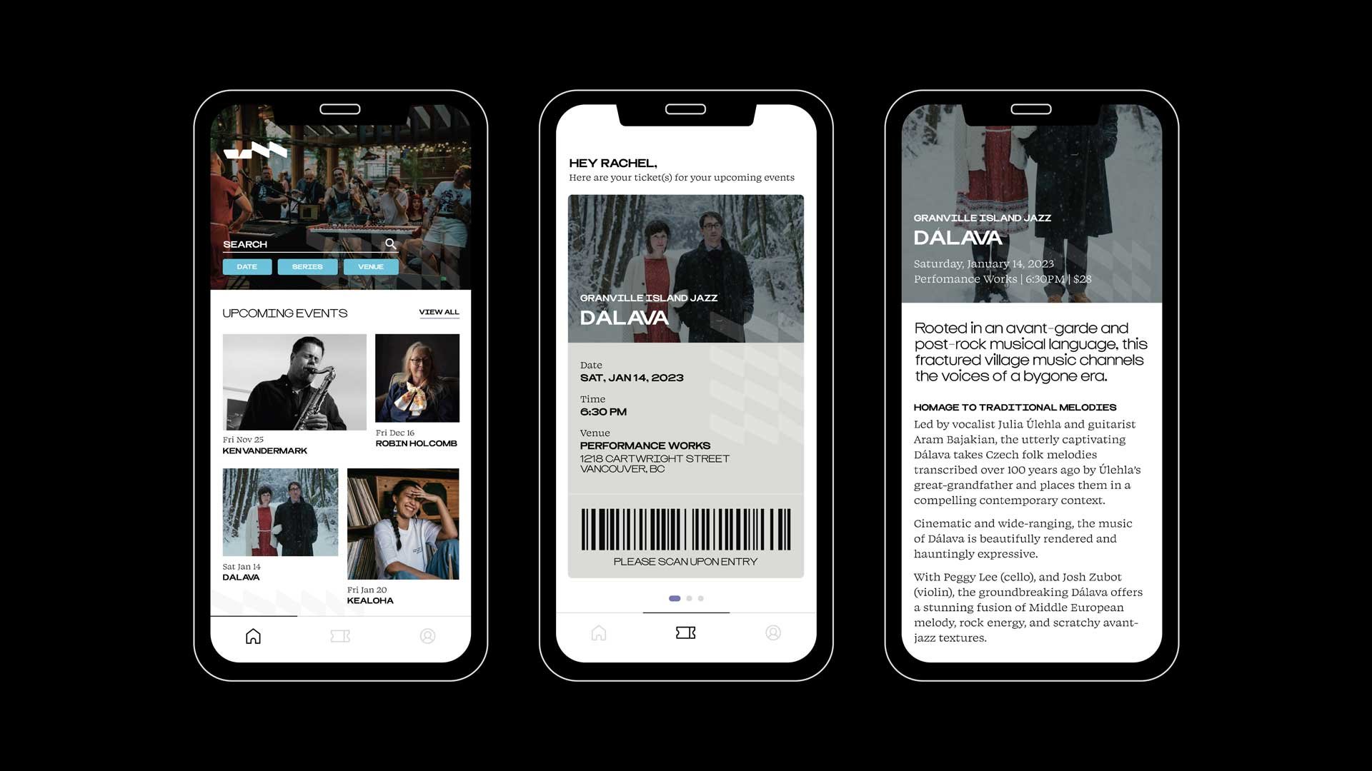
/04 DIGITAL
Website revamp and app introduction.
This rebranding project also included a revamp of their digital space. The website aims to meet the needs of customers, potential artists, sponsors, and festival organizers and it evolves into a platform where music lovers can connect and engage.
The new proposed app introduces a seamless way to purchase event tickets, keep up with your favourite artists and learn about upcoming gatherings.

/05 KEY TAKEAWAYS
With this project, I discovered that design within the jazz scene can often hold a very structured and safe concept, yet the nature of jazz is entertaining and spontaneous.
Utilizing my research, stringent identity process, and pulling from their current brand, I was able to design a refreshed look that conveyed what the brand is about and reinforce its mission and values. I learned how difficult it is to come up with outcomes that speak to an audience while keeping the project goals present.